Designing the journey

Chapter 3 of “Digital Products from zero to hero”
What is in this chapter:
- the importance, why and how to imagine the user journey in a prototyping tool,
- basic techniques and starting point in Figma for anyone,
- how to think about your user and to make decisions of the starting, simple journey.
We are not covering user journey mapping, design thinking and user research as those are deeper topics.
If you are not familiar with the travel issues I faced with my partner or you are curious how to think about a problem and put it to a simple but effective proof of concept, please check out the first chapter:
I am not a UX designer myself, however worked with a few during may last decade in the software engineering industry. And I learned that, it is much easier to develop something I already could imagine, how it should look like and how it works. As visual beings, this feels natural especially in a very conceptual industry with a lot of mental gymnastics necessary to create something new.
The approach is very similar to other industries, like a carpenter first creates drawings, drafts of the final work especially for an intricate carving as the wasted effort would be too large to be allowed. Similar rule is true during software engineering however it feels that you can rework anytime and just course correct as you learn, sometimes that course correction takes too much effort and can risk (a pet) project’s success. So, to help my imagination and to keep my motivation up, I turned to Figma:
Figma — easy to start, hard to master
As a SaaS solution (Software as a Service), you can easily jump in and create your next prototype, just register at https://www.figma.com/
Even if you never touched a prototyping tool or have no idea how to start, I still strongly encourage you to try and either follow on with the screens I am showing or create your own application, whichever brings you joy, first and foremost learn a new skill today 🙂
So as I knew and decided a few things before the prototype of my travel application, let’s summarize the starting point:
- I am creating a web application that will look like a native mobile app on Android and iOS,
- I want to make it nice while not the main purpose of this pet project, I search for something that works out-of-the-box and easy to start with.
There are a few design systems out there that are easy to use, had prior experience with Bootstrap and Material, just for simplicity I chose to go with Material UI and grabbed a community Figma project to use as a basis from here:
Link to the community starter kit I chose for my project: https://www.figma.com/community/file/847347447642725855
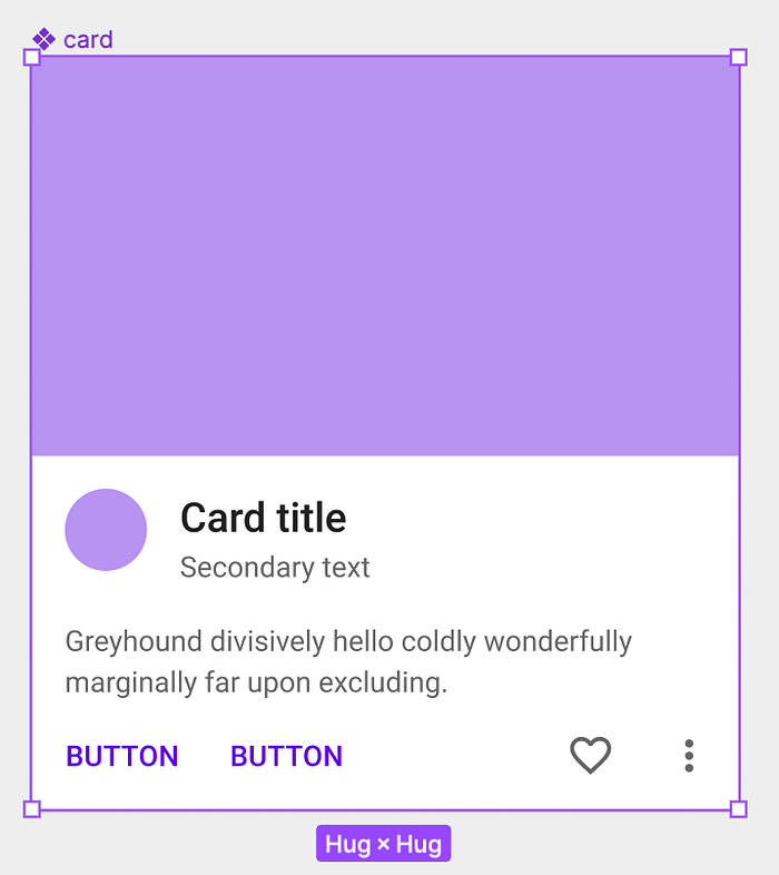
Few more ideas came to mind, as it is a travel app, would be nice to show recognizable images and communicate less in walls of text, e.g. I know I needed a city selection at one point so could present unique pictures of each destination, and I am gonna work with airlines which are easiest to recognize by their branding and logo (until fair use allows and you don’t present them as affiliates!). This led me to find a visual card design that can hold some basic text, probably some price tag later and can interact with on a touch screen that feels natural.
As I am targeting mobile screens, can’t go too small and put too much on a screen, however I can utilize scrolling much easier as that is a natural gesture, easy for all users. For my luck, there is a component in the Material UI project I grabbed and exactly what I was looking for:
A tip, when you start out the first time to design an application, look for other applications and screenshots, videos online or even try them out yourself, try a couple of them and note down for yourself what do you like, what you don’t like about the application’s behaviour. To do this, you really need to focus on the details of an app, like what buttons are there, how they are structured, what information you find first, what follows next, etc. This is something you need to practice a bit, I was working with applications for a decade now so this part came natural to me, however I remember the first time I made a prototype 9 years ago and how hard it was to pull together the navigations and the screen structure.
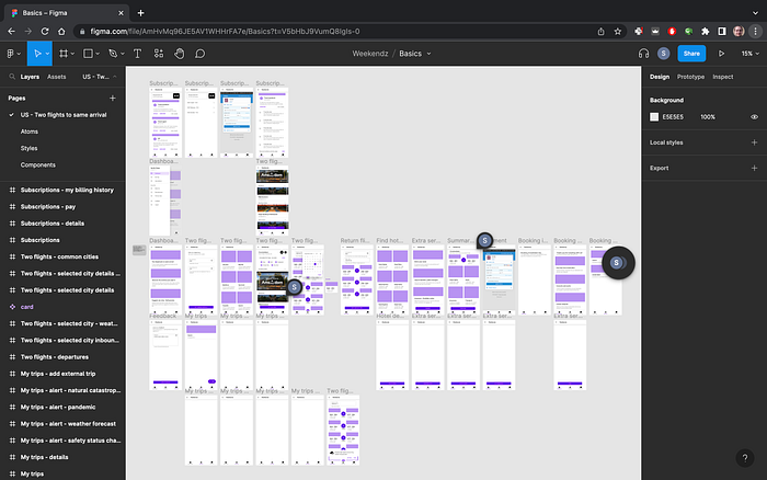
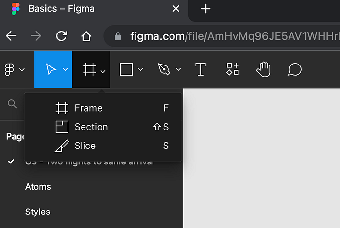
Let’s head back to our own Figma project, the first building block you need to use is the Frame, select that tool and now let’s decide the frame we are designing for:
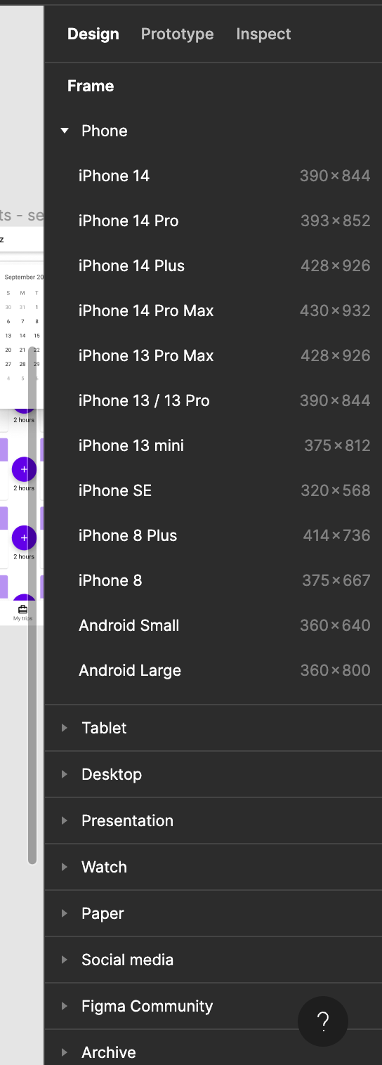
In larger projects, you or your designer will probably create prototypes with multiple frame sizes, e.g. how the application works on a phone, on a tablet or on a desktop website. For my pet project, I decided to work mobile first (no value on desktop for now) and do a responsive design (a deep topic by itself, plainly means that the website is done once and however you scale it pixel-wise, the screen will adapt and will be useable). So I needed only one type of frames, all screens will be done on the same size and I selected the closest to my real personal phone screen size so I will have a pretty good approximation.
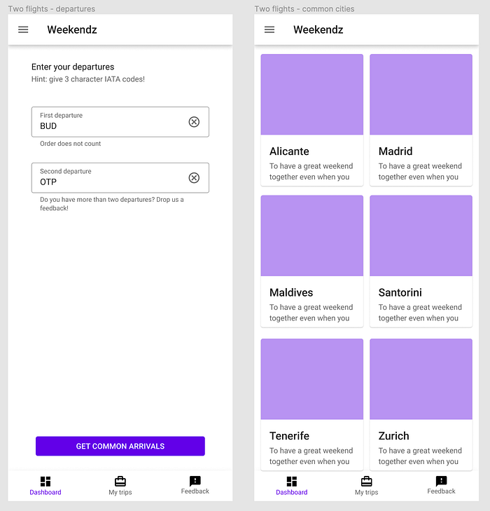
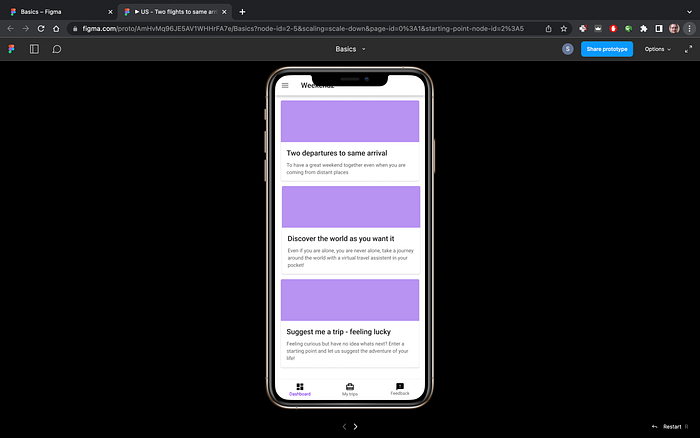
First of all, I need a starting screen, the dashboard, how it is usually called, so my user can start the journey from there, return here easily if needed to restart or just generally to act as a hub for future features I want to add to this application. How to do this? Just grab some elements from the Material UI Figma project and copy-paste to your frame, rewrite the text, decide on the journeys (I will implement only the first, but I wanted a good feel for the prototype so filled it with two more journey ideas), and I always liked the bottom navigation for an application, easy to reach with one hand so I added the main features there (dashboard/home button, my trips for showing what was put together already and a feedback function, especially for early adopters).
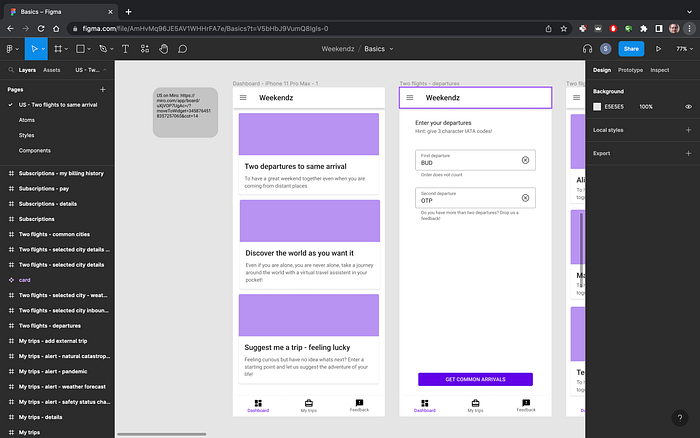
Then I looked back on to my Deepnote proof of concept and took the steps for inspiration what should come next, adding frames for each screen and then putting in the basic components, keeping the top title and bottom navigation by copying from the dashboard, adding input fields for the departure airports and a button to confirm my selection, I expect waiting before I get the cities and imagined how I will list them out:

Now I have a few screens set up and designed, now comes the most valuable step in my opinion, actually chaining them together so our prototype becomes alive! It is very simple to do in Figma (adapt this step to your choosen prototyping tool though), on the top right side click on the “Prototype” button and new interactive bullets appear on the components you selected. Just select your first card and drag the bullet on the right side to the screen of the two departure airports and drop it. If you now click on the play button (right top), you can tap on the card and the next screen will transition in! That is it, now you have your first working prototype and basically you already used all the tools you will need for a long time. (Of course if you want to be an actual designer and create high-fidelity prototypes there are much more to learn on styling, components, transitions, etc.)
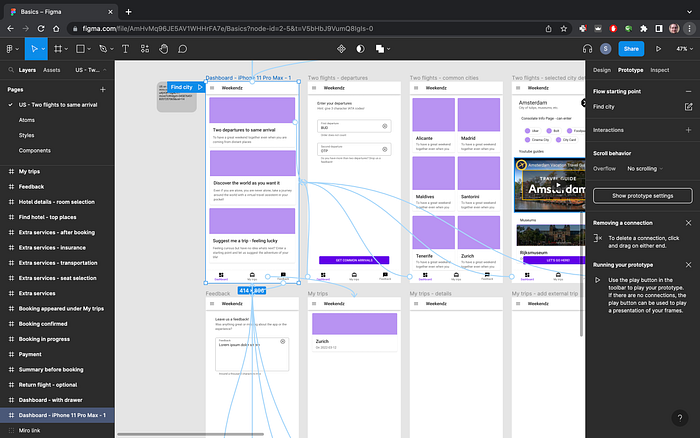
Now let’s build out the flow, still keeping the steps to the Deepnote one, first input the two departure airports (keep simple but descriptive, if I look at the screen two months from now I still should be able to understand what it does and how it should work). When done with the inputs, add the action button, as I am still on a phone and imagining myself using it in the left hand, a wide, still not too large button at the bottom should be easy to reach after typing in the departures. Adding the city list screen too, I was playing with two or three in a row, however found it more relaxing to have two in a row as I would like to present a one-liner later for each city here and after all I connected the button to this screen:
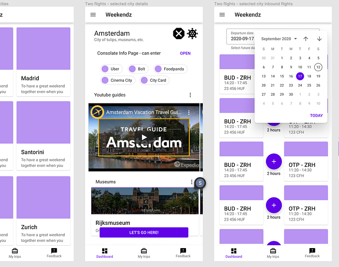
Moving on to next screen when any city was tapped, just starting the search for flights, I decided to use a ready made in-progress component later in the app so skipped designing it in Figma as it would be a waste of time for now. When designed the flight screen, had some inspirations on what I would like to know about a city when deciding to go there, so moved the flight screen a bit to the right and added a new screen in between with the components I could imagine, online video tour guides, most notable museums, my preferred services are available or not (e.g. not every city has the same taxi/ride-sharing services available), etc.
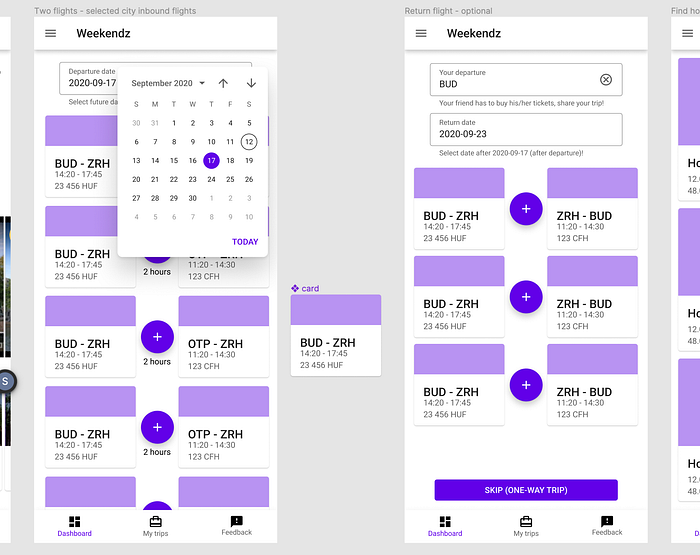
Took most of my time on what to tell about each flight pairs and how best to represent them, as for my journey this is the critical point. Most of the time as a user of the app I will spend here browsing and comparing different options on different days, etc:
When the main point of the journey was done and I could start to develop, I stopped at this point in Figma and switched to writing the first user story and setting up the tech stack for myself, these topics I will show in upcoming blog posts so keep tuned!
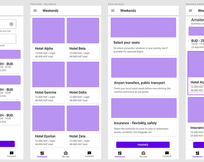
However from time to time I returned a bit to the Figma flow and added new journeys and ideas, first finished a booking journey based on a recent experience with budget airline bookings and used the cards as building blocks (they are large, visually pleasing and intuitive to interact with):
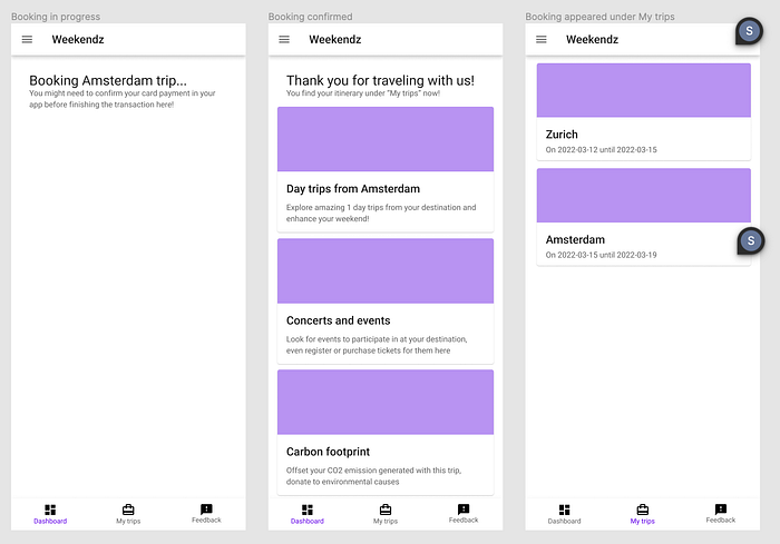
This helps me put myself into the mindset of my customer (besides that my target customer is myself in this case) and to think how the journey would unfold would it be a real application.
As I was designing the check-out flow and learned that there are strict requirements to ever be able to do in real production, namely IATA approval and certificate, backing it by an actual tourism agency, I was thinking another way to counteract cost of operations (e.g. the API calls to the Amadeus system), if there are extra features that are easy to scale, a subscription model could be feasible:
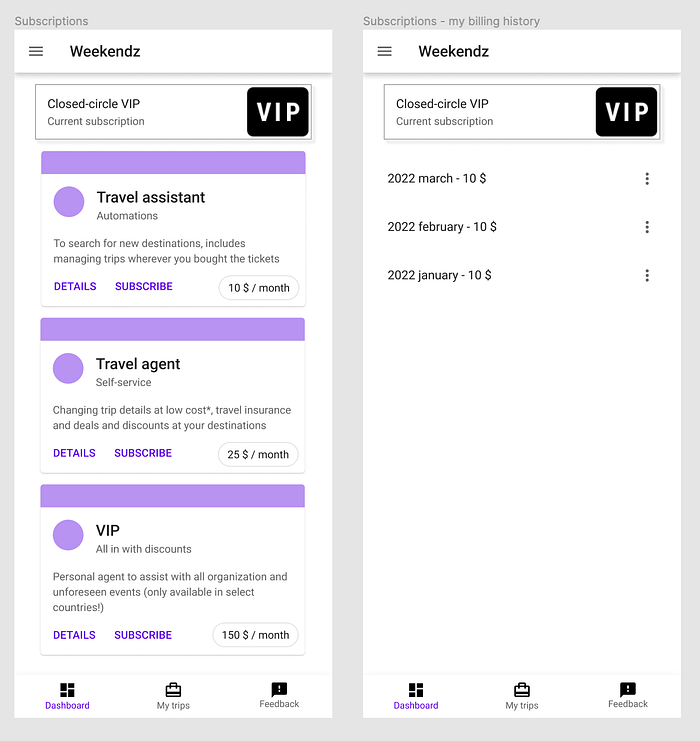
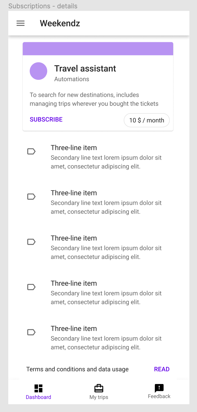
From earlier experience working with applications, invoices, legal requirements and how to keep customer from leaving (and I need to create a type of customer who can use the application anyway, my close cirlce of testers), came up with a couple of possible packages and costs, need to represent the current status of the customer and easily comparable options to upgrade, must show previous payments and terms&conditions, etc.
After a few hours of work, trying out the prototype with the play button (you can even use a connected phone with the Figma app to test the prototype even better), I was satisfied with the result:
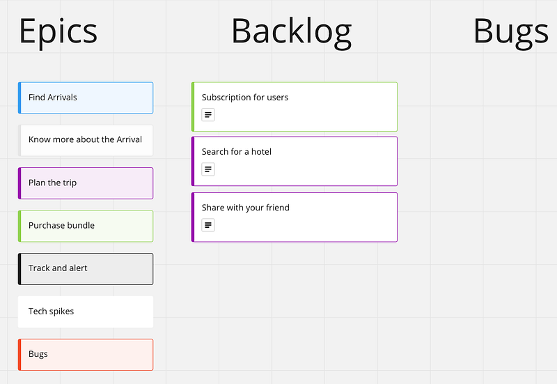
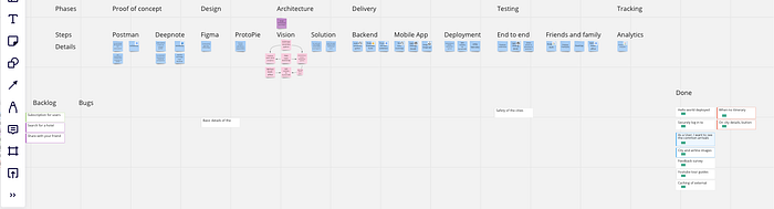
P.S.: At this stage, I could not wait longer to jump in and start to work on it, however I knew I needed more structure to be able to pull of my newest pet project. Only having a few weekends and maybe a few hours per evening to work on it, need to be able to focus on the next most important task. And I always have to know where I was right after jumping back in, so in next blog post I will show you how I built up my simple backlog.
Insights
- You don’t have to be a designer to use a tool like Figma effectively! It is another way of communication, wireframes, design frameworks help you to present your ideas in compelling ways and later you can team up with a designer to flesh out own brand, unique feel and UX for your app (this is a large effort and rarely a deciding factor in competition, first your app needs to solve a real problem)!
- Prototyping helps you put yourself into the shoes of your user and think like them, greatly boosting the focus and result of your implementation when you exactly know how it should work when you are done!